Metro property,
Case study : Collaborative & functional

Metro property,
Case study2:
Collaborative& Functional

Project Overview

Project Overview

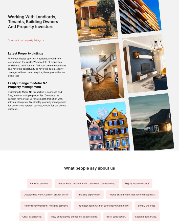
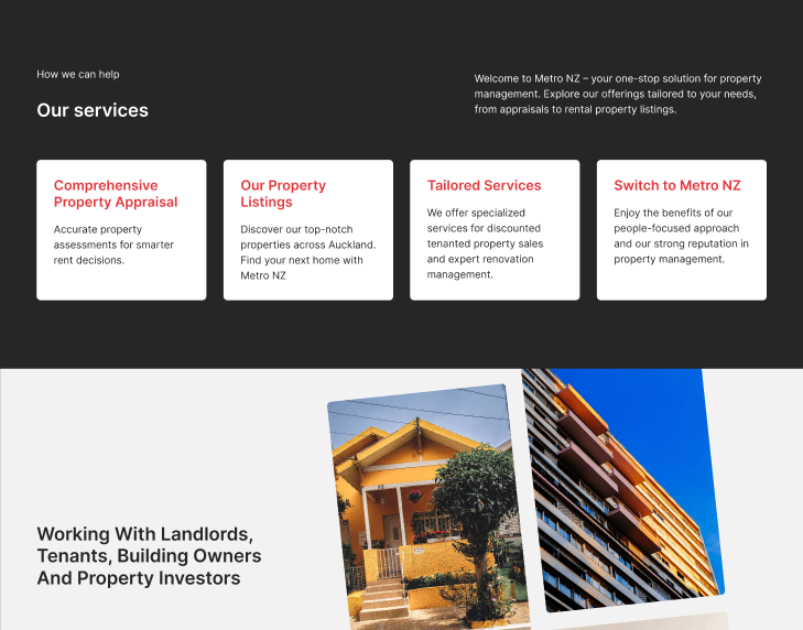
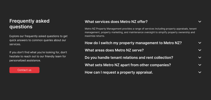
Metro NZ Property Management, a leading player in the property management industry, is committed to providing top-notch services to its clients. However, feedback from numerous customers has highlighted the need for an improved and more user-friendly property listings page. Customers have expressed concerns such as difficulty finding rental properties, a confusing tenancy application process, and a cluttered website interface.

Our task…

Our task…

Redesign the homepage and search function, utilising the customer research provided.

Redesign the homepage and search function, utilising the customer research provided.

Timeline

Timeline

2 weeks

2 weeks

Step 1:
Discover

Step 1:
Discover

Protopersona

Protopersona

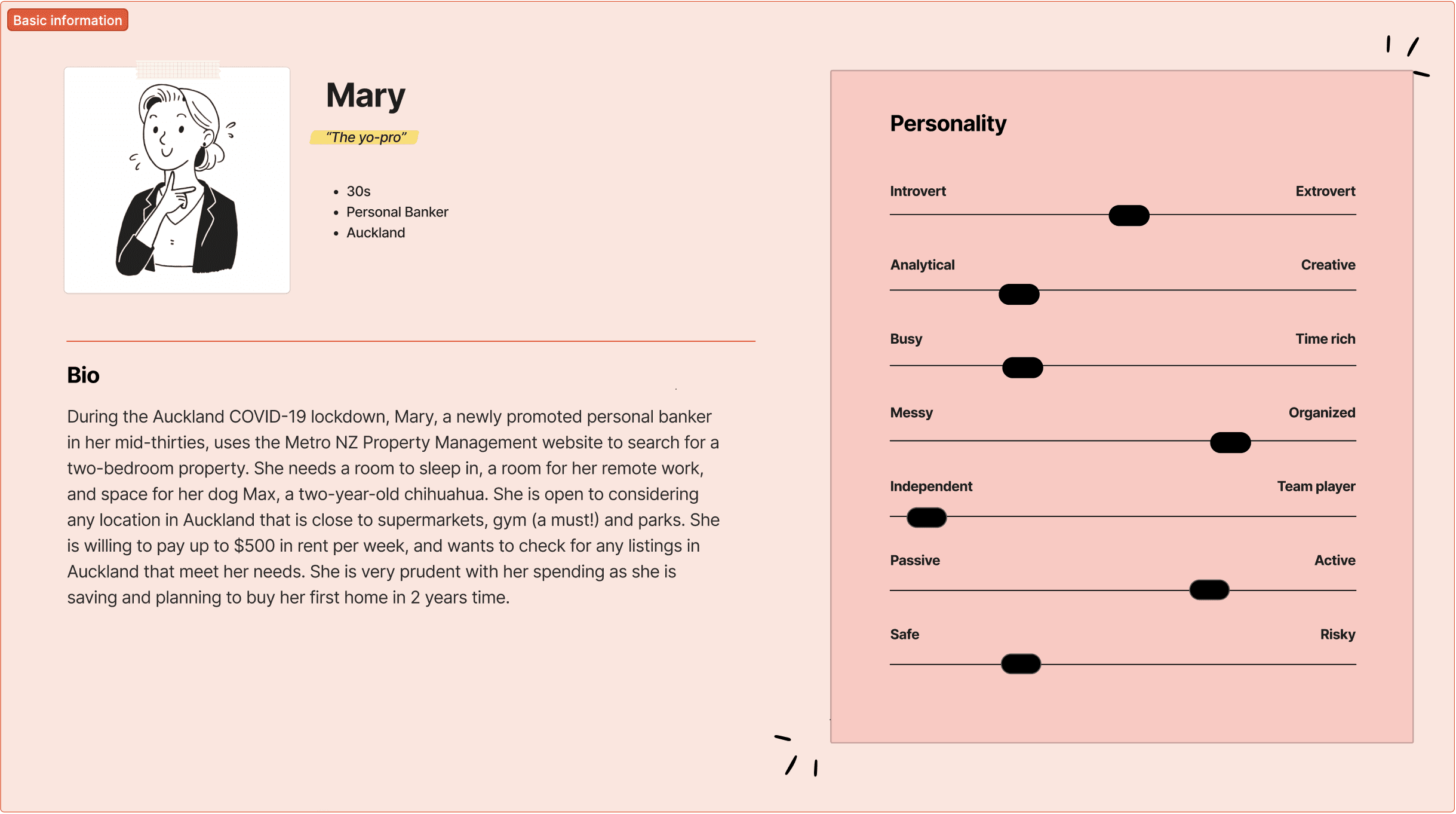
In this case study, we leveraged customer feedback and research provided to develop our initial persona prototype. This helped us refine our scope and gave us something to refer to when looking at MVP solutions.

Metro Property Website: Original

Metro Property Website: Original

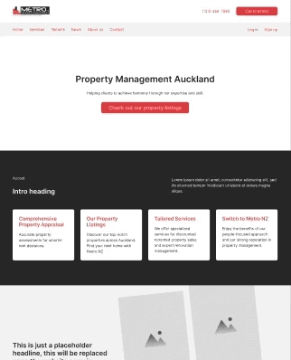
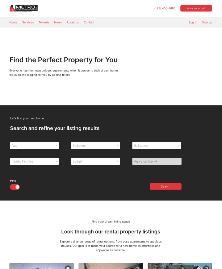
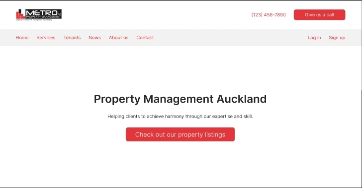
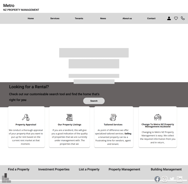
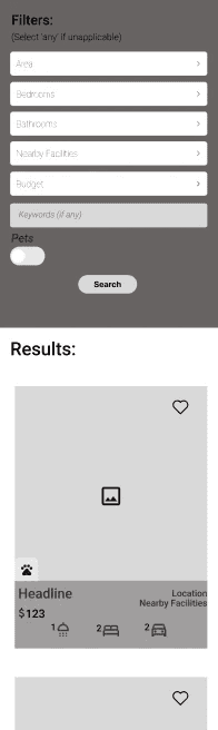
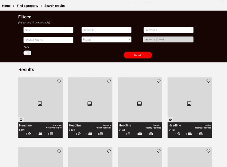
This was the original concept we analysed heuristically and against customer pain points when looking to redesign. Their website has since been updated.

Step 2:
Define

Step 2:
Define

User Story

As a renter with specific lifestyle needs, ​

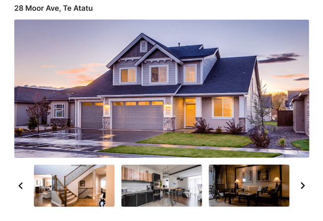
I want to be able to find & compare suitable rental properties before committing to one, ​

So I can better manage my finances.

Background

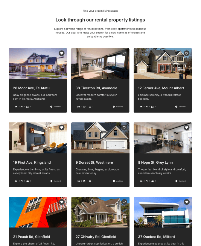
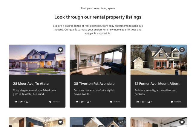
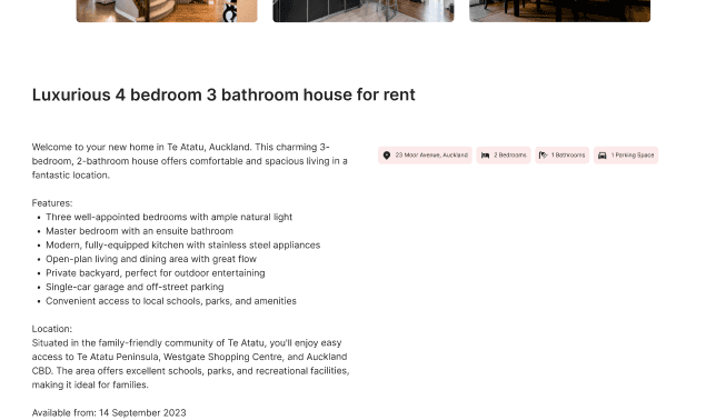
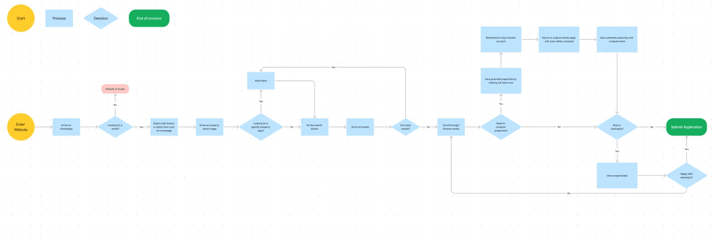
Users need to be able to filter through a large amount of properties and compare them to be able to narrow down what they are interested in renting.

Issues

Users are unable to navigate to the homepage, view relevant listings, and compare them effectively (before committing to a property).
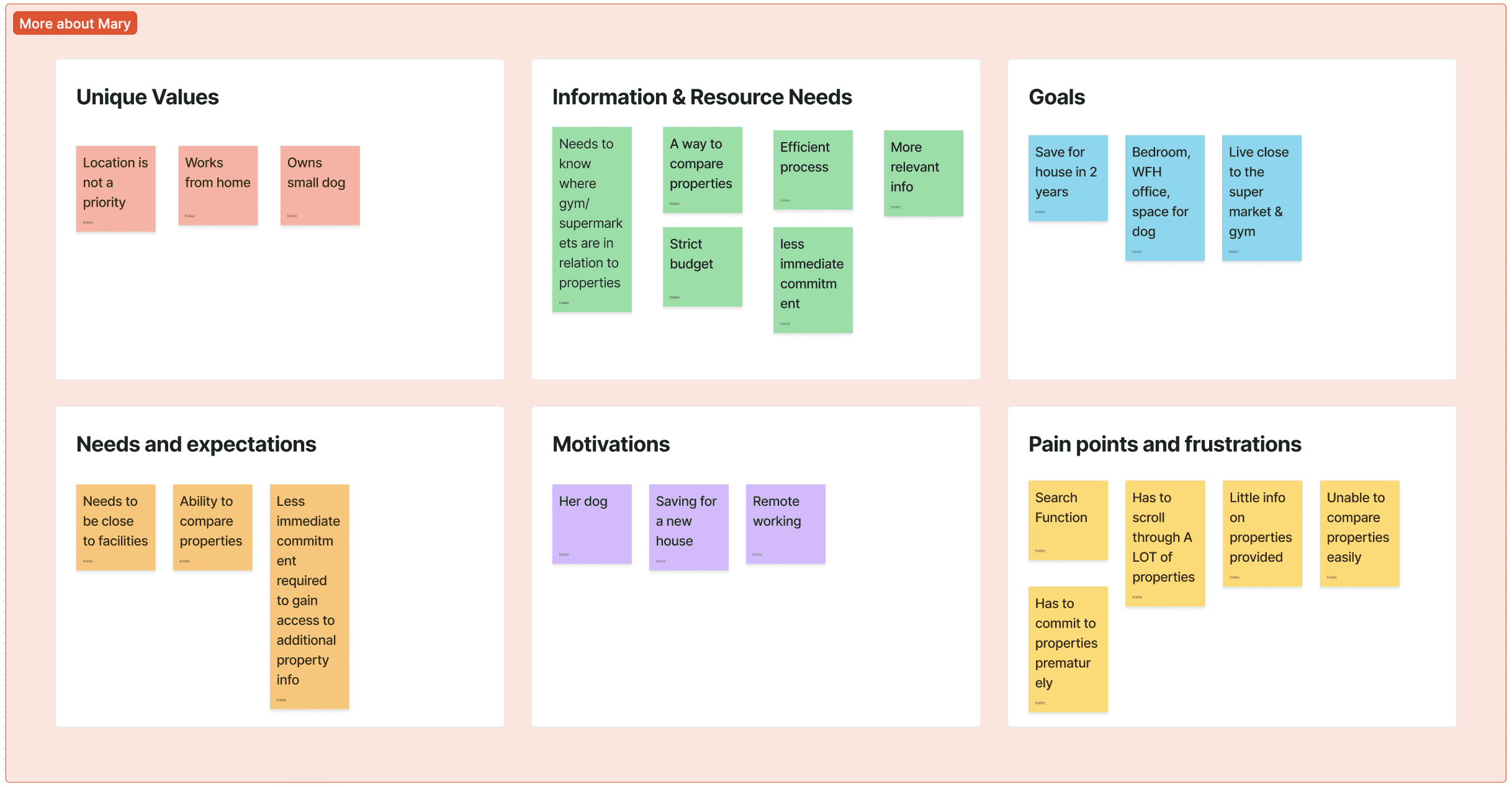
Problem Statement

Mary is a newly promoted worker moving into the next phase in her life, she needs to be able to find and compare relevant rental listings efficiently in order to maintain her lifestyle and reach her long term goals.

Step 3:
Develop

Step 3:
Develop

Ideation Session

We conducted an ideation session, to fully assess what we could do to rectify the issues. We were then able to consolidate and settle on a simple and effective MVP solution that we knew would hit the brief, and that we were confident we could execute well given the time constraints. We would then implement other solutions (should time allow) as an added bonus.

Top Solutions

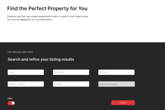
  1. Simplify/redesign home page with an emphasis on the search functionality.


  1. Expand and refine the search functionality/filters to include a wider range and increased specificity.​


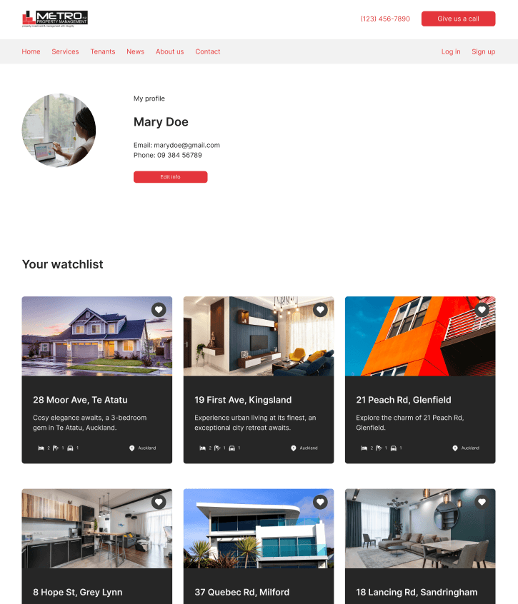
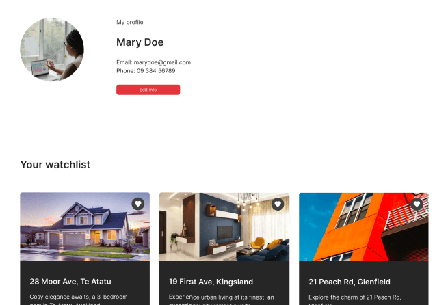
  1. Allow users to ‘save’ potential properties to compare potential properties easily​.


  1. Redesign property tiles/information provided to include more relevant information so less time investment required to compare a properties.
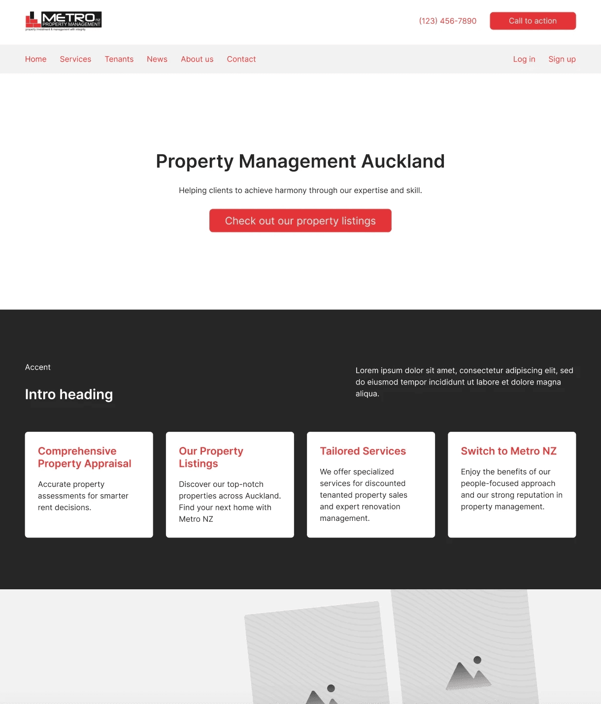
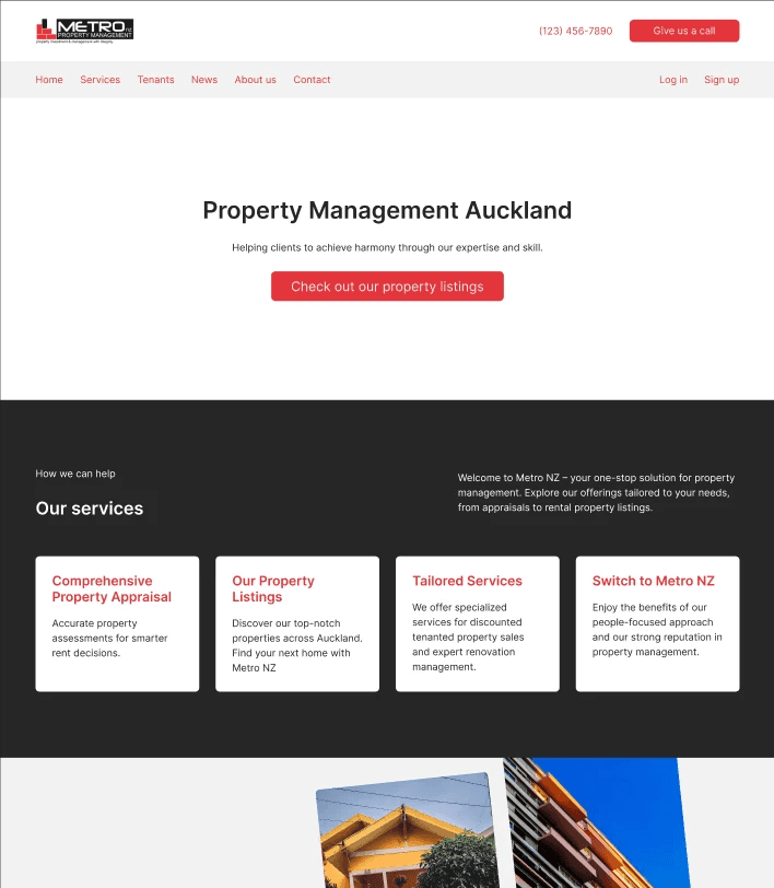
MVP Solution

Simplify/ redesign the home page with an emphasis on the search functionality.

User flow

User flow

We used user flows to ensure the process was simple and straight forward to navigate

We created user flows to ensure the process was simple and straight forward to navigate

Wireframing

Wireframing

Wireframing

Simple, Clean, & Easy to Execute

We protoyped and performed user testing on our wireframes, as well as respective iterations.

First Iteration & Prototyping

First Iteration:
Prototyping

Profile Design

Having a profile and watchlist was something we wanted to create assuming we had time and was manageable for the developers to generate

UI kit/ Colour Palette

UI kit/ Colour Palette

Rebranding and changing the colour scheme fell outside our scope, as we wanted to keep this project as realistic as possible. We did struggle with a limited range, and therefore wanted to include our UI Kit in our user testing

Rebranding and changing the colour scheme fell outside our scope, as we wanted to keep this project as realistic as possible. We did struggle with a limited range, and therefore wanted to include our UI Kit in our user testing

Search Filters & Functionality

Based on user needs that were not linked to a specific area, we added multiple optional search filters.

Property view

User Testing: Research Plan

User Testing:
Research Plan

Full research plan & test script can be provided on request - brief summaries below

Key Questions

  • Are users able to find the search functionality on the site without help

  • Are users able to narrow their search appropriately by utilising the filters ​


  • Can users find & identify relevant information on the property results​


  • Where is the user struggling the most in the new design, and why are they having difficulty there

  • Can users find & identify relevant information on the property results​


  • Where is the user struggling the most in the new design, and why are they having difficulty there

User test Report

User test Report

User found the website super straight-forward and simple to use and complete the tasks given - to find the search page, narrow down their search and view their search results. There wasn’t any prompting required and they were able to point out relevant information when requested.

User found the website super straight-forward and simple to use and complete the tasks given - to find the search page, narrow down their search and view their search results. There wasn’t any prompting required and they were able to point out relevant information when requested.

What did they like?

Clear simple layout, with a good range of filters. Also liked being able to view a substantial amount of relevant info without having to click into the property tiles when browsing results.

What didn't they like?

The Contrast between the black and white portions of the website, and the large white spaces in the website were harsh on the user’s eyes. This made it difficult for the user to read and decreased comfortability when moving through the process, often squinting at the screen.

First Iteration

First Iteration

Failed user testing on aesthetic issues, which caused eye strain

Failed user testing on aesthetic issues, which caused eye strain

Second Iteration

Second Iteration

Incorporated user feedback and implemented changes in UI whilst maintaining the brand's colour palette.

Incorporated user feedback and implemented changes in UI whilst maintaining the brand's colour palette.

Suggested Changes

User suggested changing the colour of the white tiles on white background or toning down the bright white areas - or else break up the big spaces a bit. No issue on the search results page as there was less white empty space.

Changes Implemented

We toned down the contrast as well has the harsh colours to make it more user friendly, whilst still maintaining enough to ensure it was also accessible for colour blind users.

We toned down the contrast as well has the harsh colours to make it more user friendly, whilst still maintaining enough to ensure it was also accessible for colour blind users.

Step 4:
Deliver

Step 4:
Deliver

Final Design

Final Design

Use the arrows to scroll through some snapshots, Figma file available on request.

Use the arrows to scroll through some snapshots, Figma file available on request.

Results, Reflections & Outcomes

Results, Reflections & Outcomes

This project provided us with invaluable insights into the process of website development from a developer's standpoint, all while navigating stringent time constraints.

" Our primary goal was to create a redesign that hit the brief as effectively as possible, and we succeeded in doing so. "

Despite the challenges posed by the brand's design guidelines, we successfully delivered a clean and straightforward website. Our design exceeded expectations and not only resolved the MVP issue by prioritizing search functionality, but also allowed for seamless integration of multiple solutions thanks to our streamlined 'less is more' design approach.

Explore my other projects:

Datacom - live project

2023

Turner's Insurance - case study

2023