Metro NZ Property Management, a leading player in the property management industry, is committed to providing top-notch services to its clients. However, feedback from numerous customers has highlighted the need for an improved and more user-friendly property listings page. Customers have expressed concerns such as difficulty finding rental properties, a confusing tenancy application process, and a cluttered website interface.
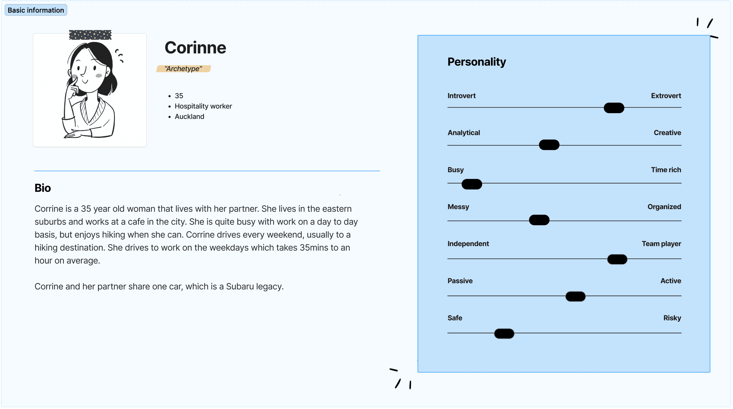
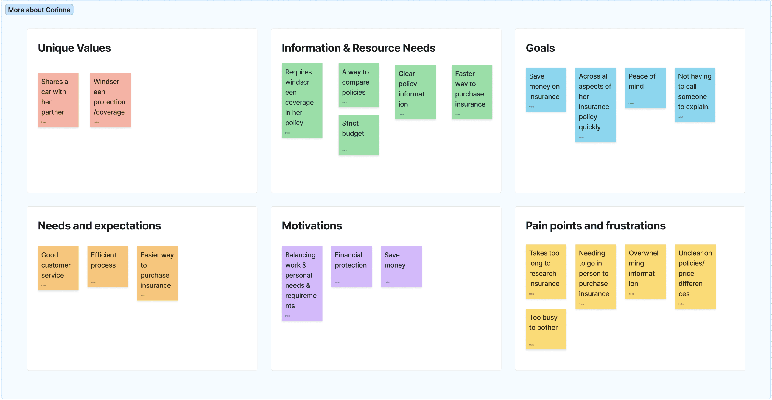
In this case study, we conducted both a stakeholder and customer interview to ascertain the main issues we were looking to solve, and how we could solve them.
This involved the production of interview and discussion guides, and were both conducted virtually


User Story
As a car owner with limited interest/ knowledge on car insurance
I want to be able to find & compare insurance policies
So I can understand and evaluate policies accurately and easily.
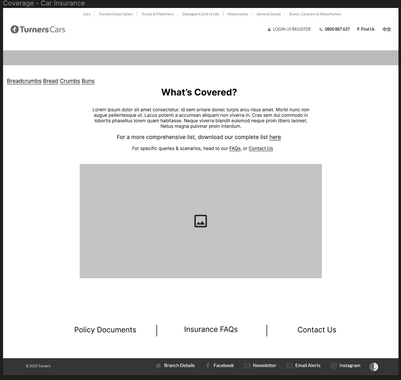
Background
Customers need to conduct their own online research to compare insurance pricing plans from different service providers.
Issues
Customers often spend a significant amount of time researching the different prices that are offered. Sometimes quotes can only be supplied over the phone/in person because they require additional information from the customer.
How might we…
How might we make it easier for users to compare insurance policies (accurately)?
How might we make it easier for users to get an insurance quote from Turners?
How might we make it easier for users to find relevant information on the Turners Insurance page?
How might we allow users to purchase an insurance product online?
We conducted an ideation session, to fully assess what we could do to rectify the issues. We then split off to individually continue the project, designing, testing and iterating our chosen ideas.
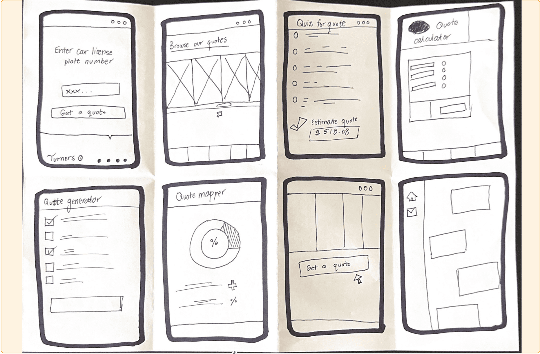
Top Solutions
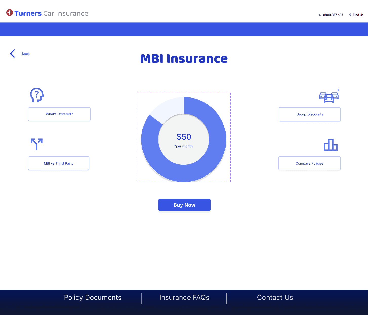
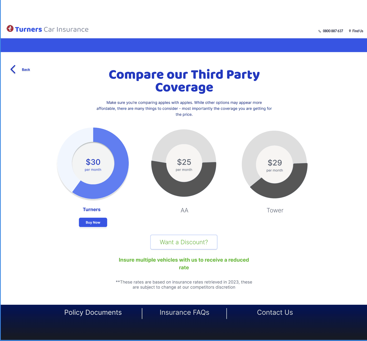
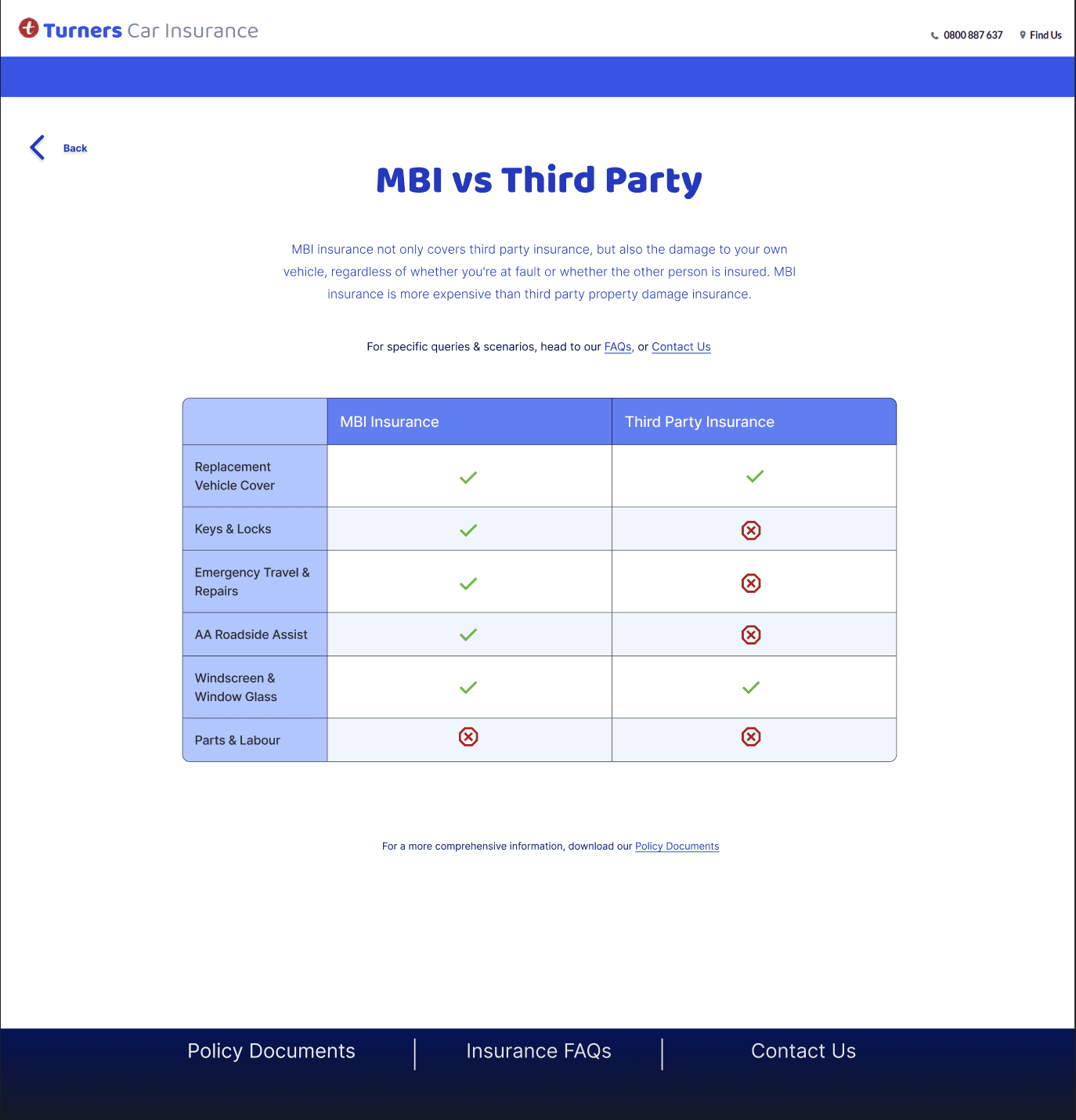
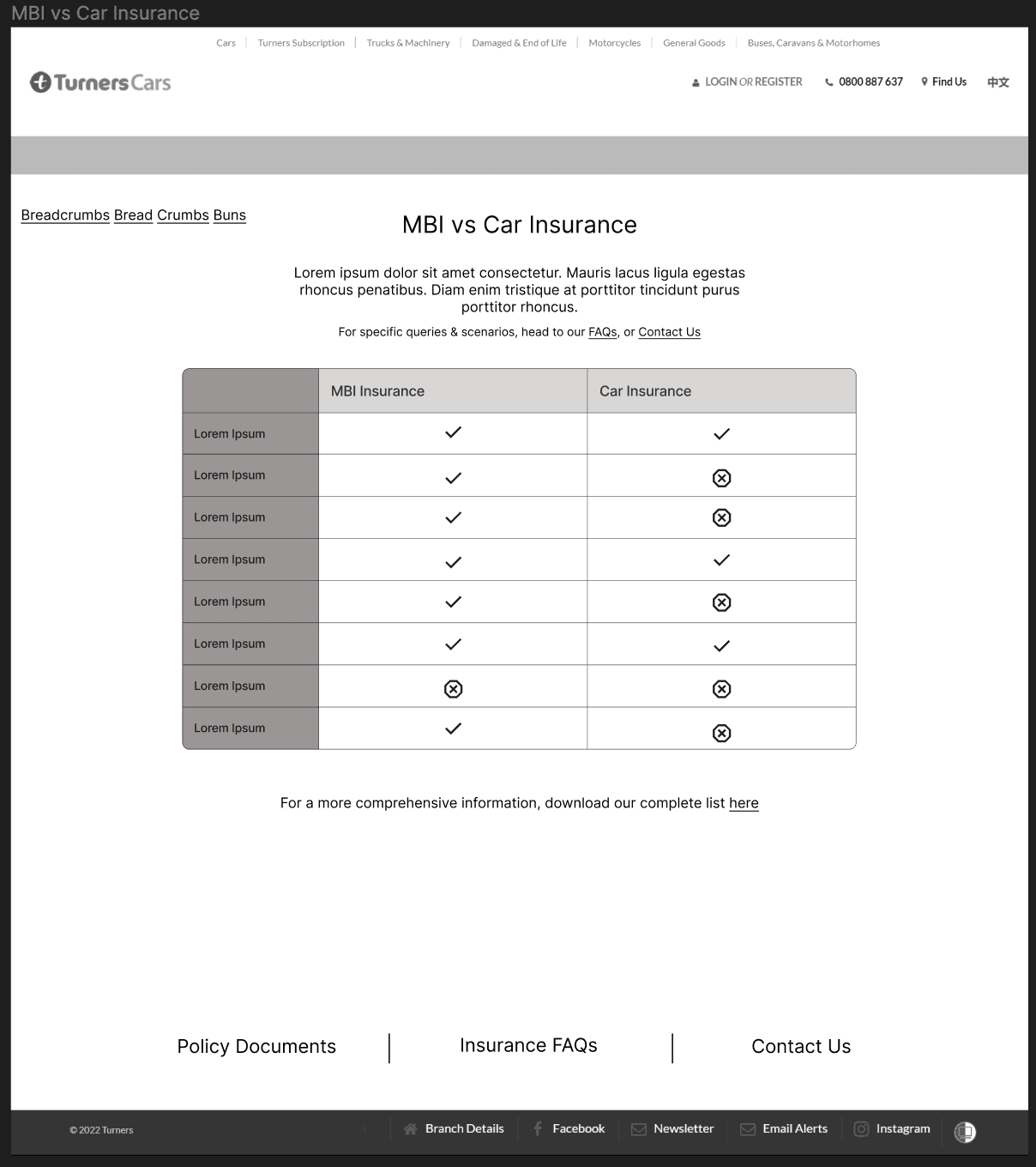
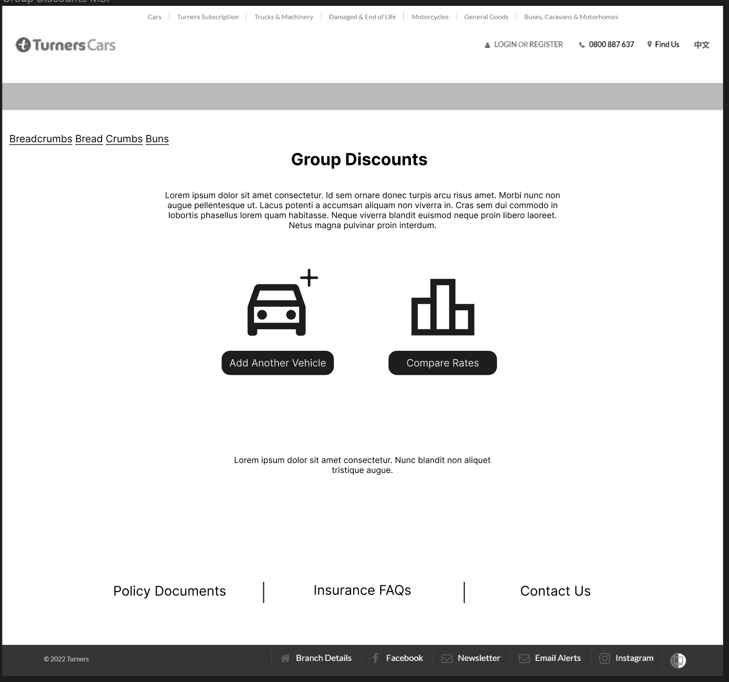
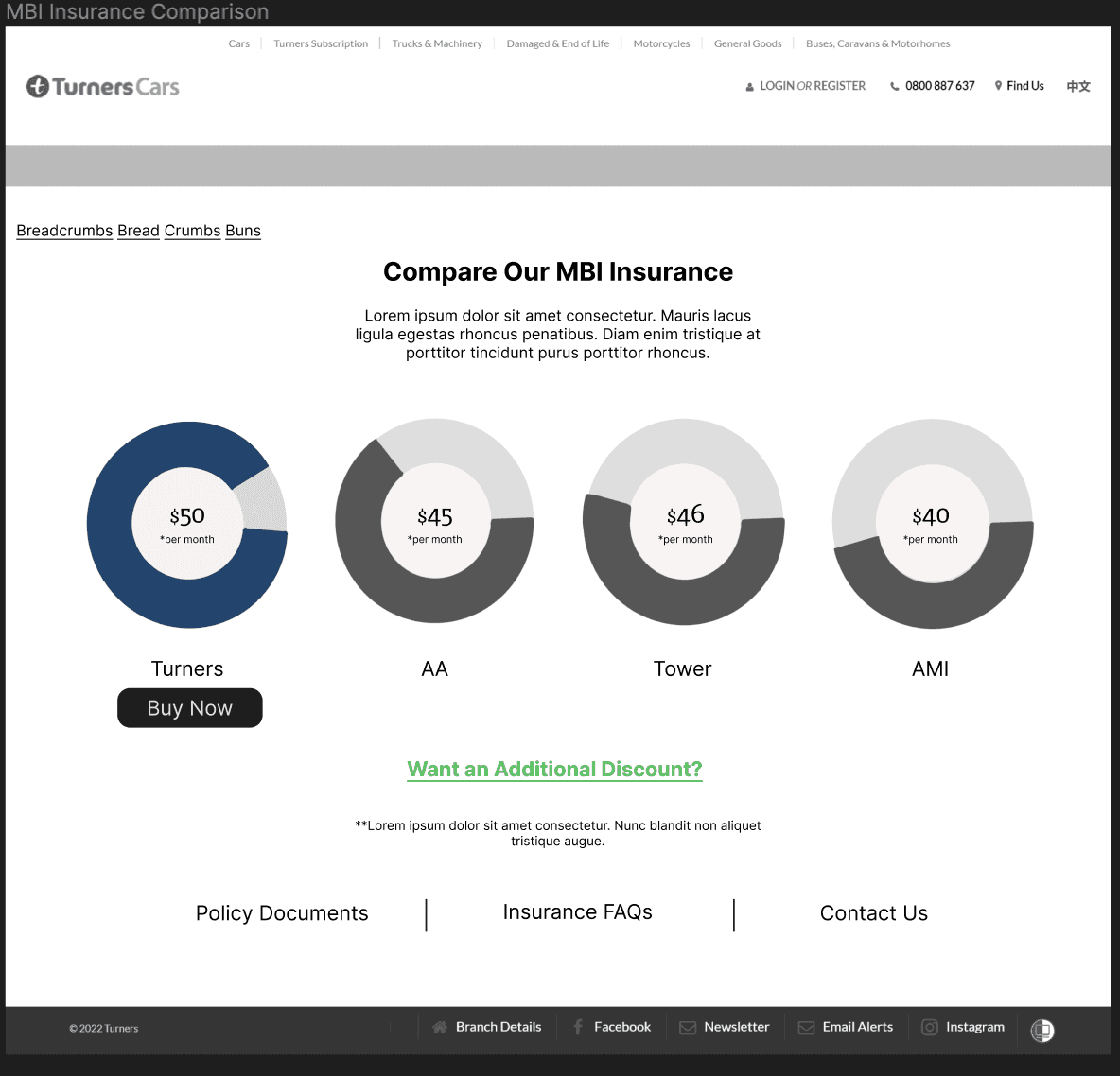
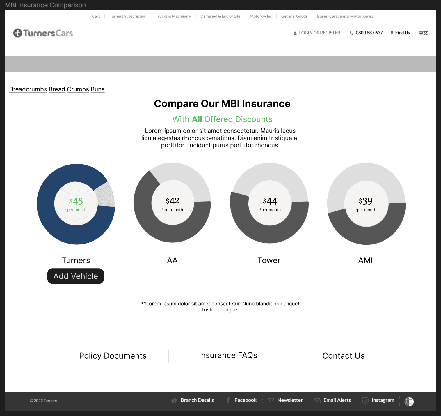
Comparison charts/ tables to highlight policy differences.
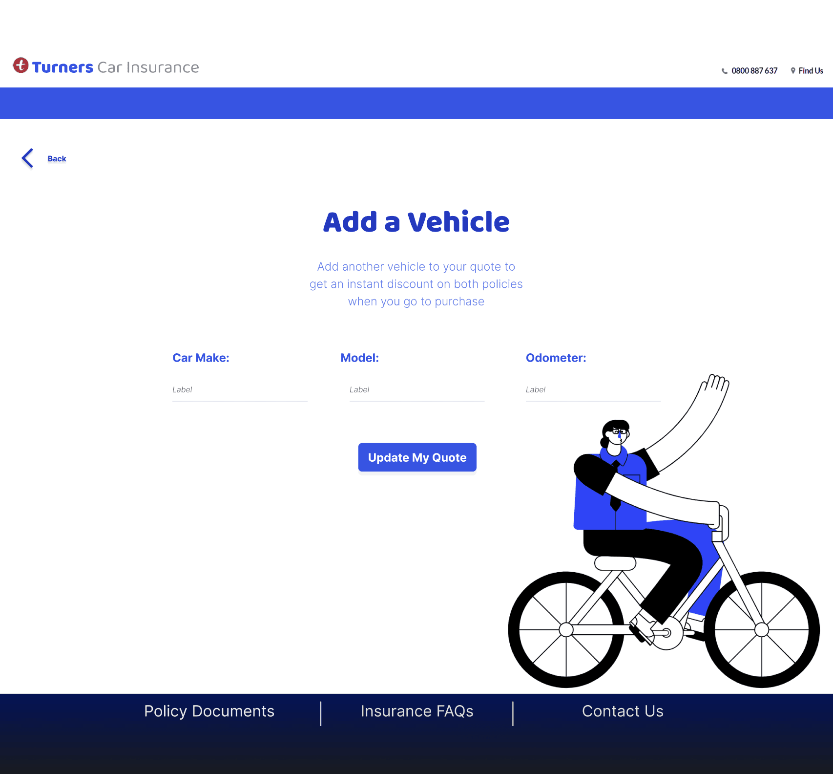
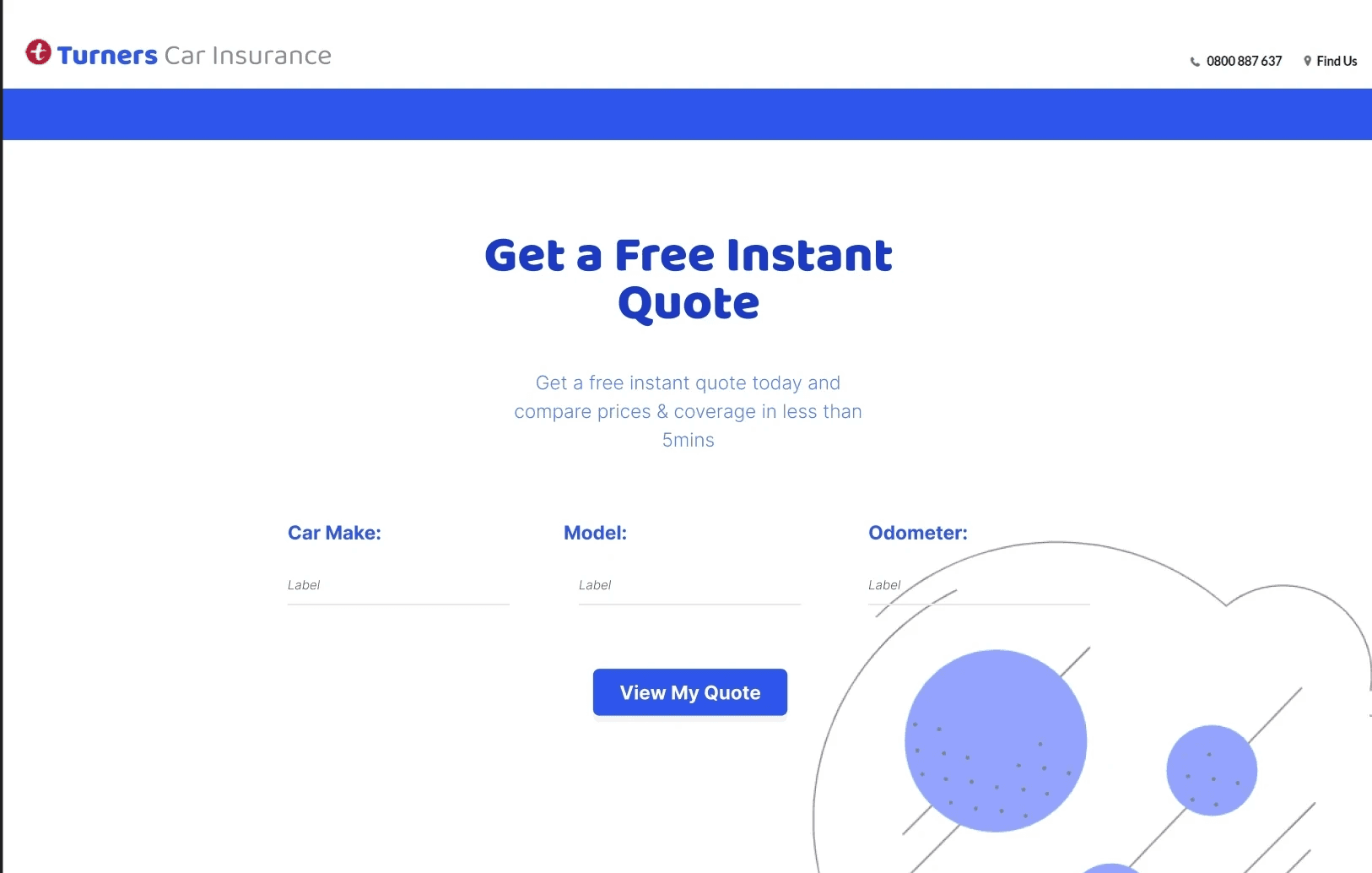
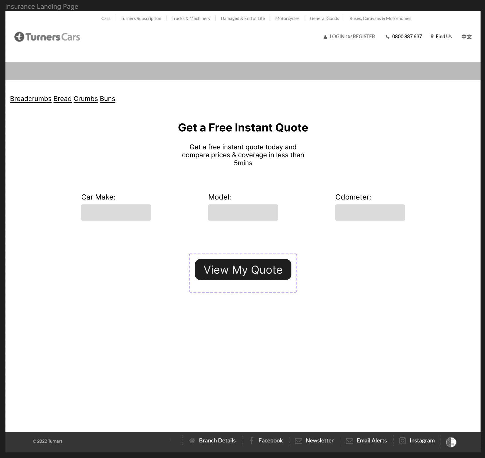
An instant quote generator.
An AI chatbot to provide additional and personalised assistance.
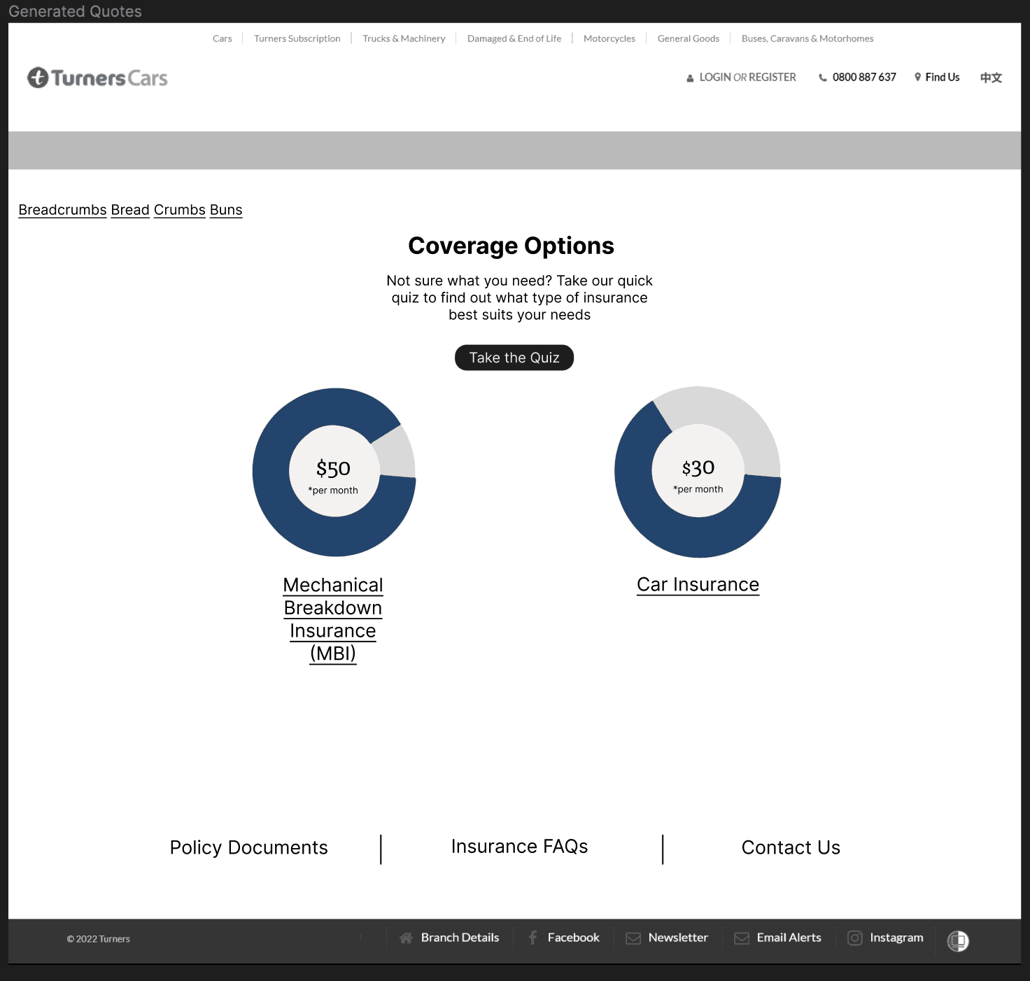
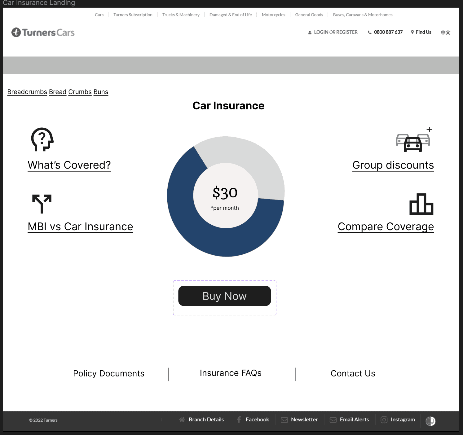
A coverage visual key in the form of a pie chart.
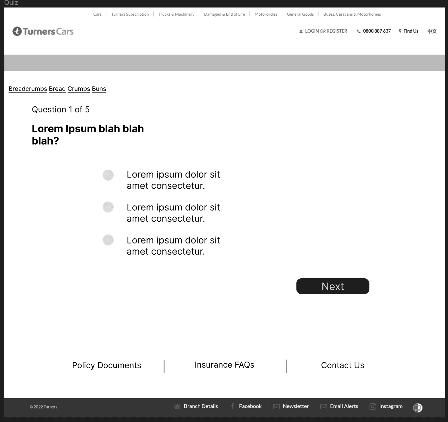
Quiz to help identify what policy would best suite your needs
MVP Solution
Comparison chart/ tables to convey key differences in policies & pricing
The organisation of information within the website helped us better focus on areas of improvement and ensured our scope wasn't too wide given our time constraints.
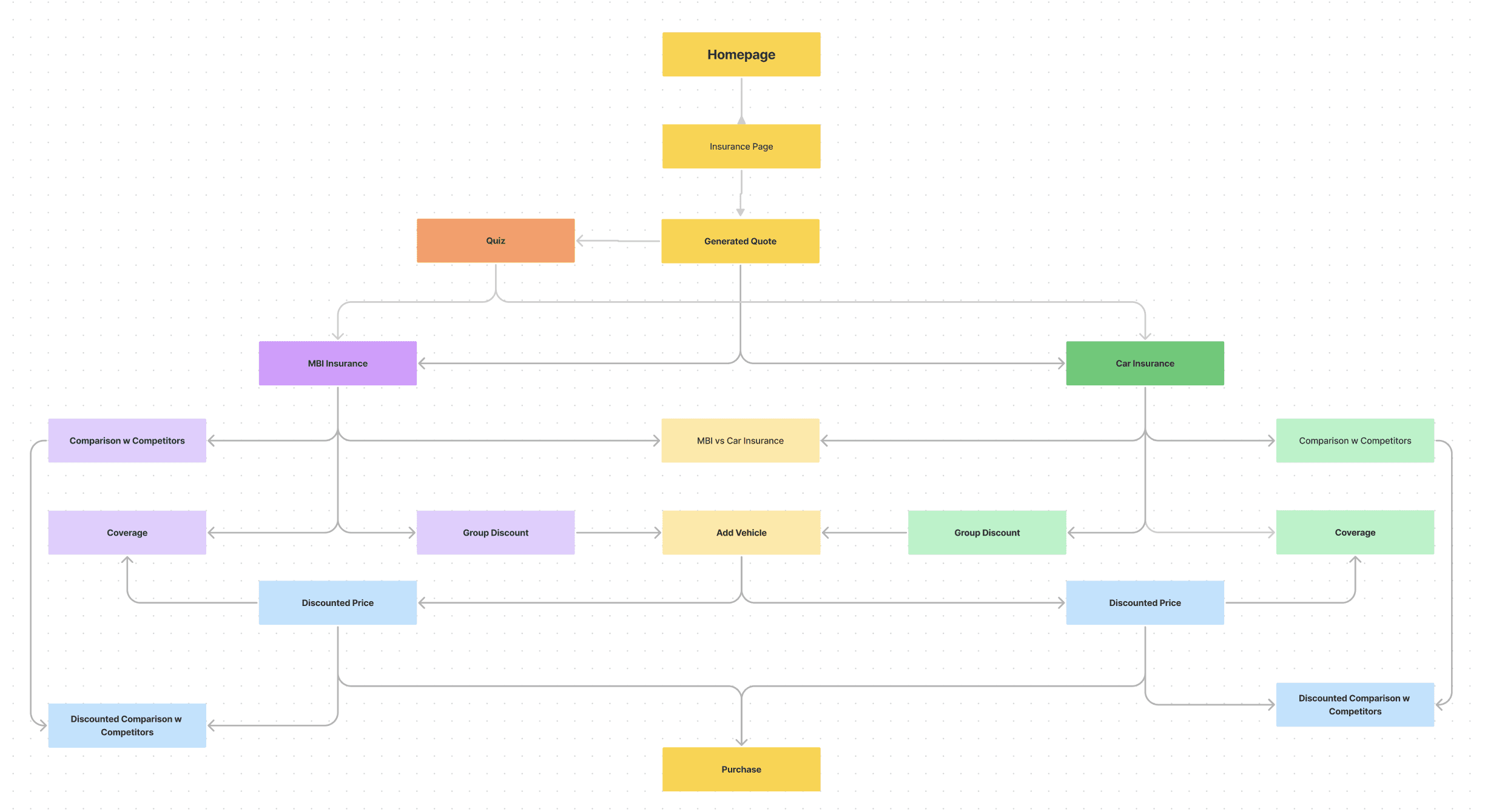
User flows helped us visualise the pathways our users might take naturally
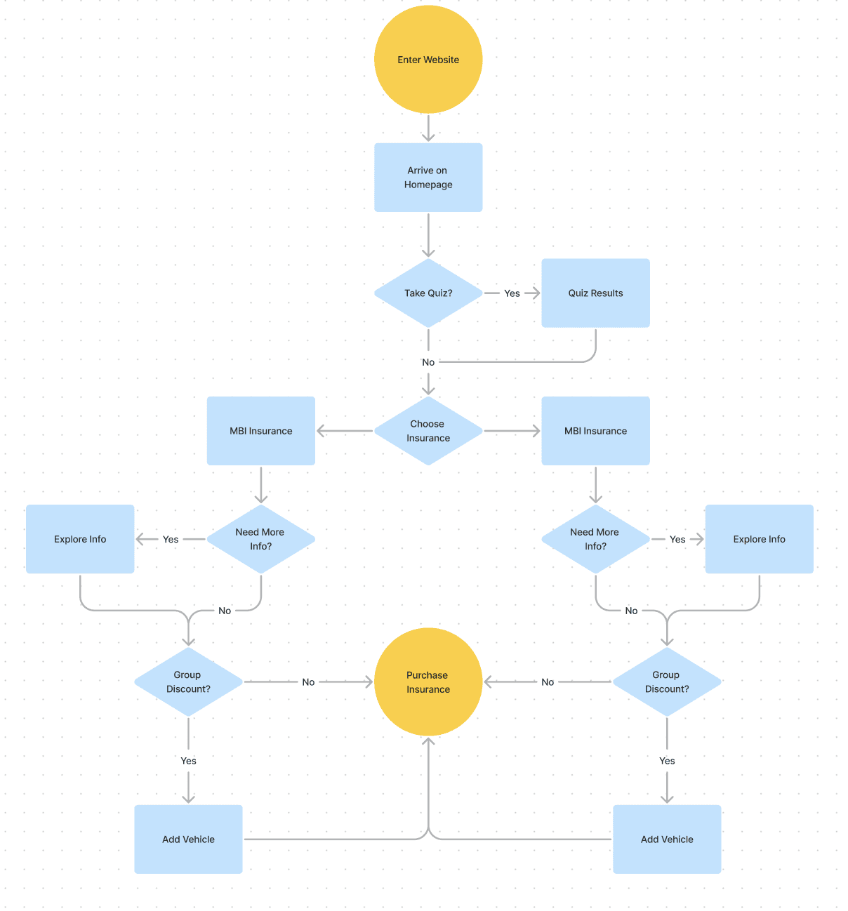
Simple, Clean, & Easy to Execute
We protoyped and performed user testing on our wireframes, as well as respective iterations.
Full research plan & test script can be provided on request - brief summaries below
Key Questions
Are users able to understand the different policies quickly?
Are users able to compare policies efficiently?
Are users able to purchase the appropriate policies easily and intuitively?
Where is the user struggling the most in the new design, and why are they having difficulty there